Most of the people I’ve told that I have a spreadsheet where I track everything I’ve worn give me the same reaction and it looks a bit like this:
The concept of the ‘Cost Per Wear’ (CPW) of my clothes was introduced to me by Becca (aka @blondebrokeandbougie) on TikTok in this particular video. CPW is exactly what you’d think it is: calculating how much it costs every time you wear a certain piece of clothing. She uses a spreadsheet to track everything she wears every day so she can see how much of her wardrobe she wears and what she can get rid of.
As a person who loves data, in particular, data about my own habits, this sounded right up my street. I downloaded Becca’s template CPW spreadsheet because my Excel skills are not good enough to generate the masterpiece she’s created.
To begin, I had to input all my clothes into the spreadsheet including information like price, brand, year it was purchased, and if it was new or secondhand. This did take a while but I just started adding them as I was wearing them so it was easier. I had to find a lot of the prices on email receipts etc. This in itself was an eye-opening experience and made me realise how many clothes and shoes I had and it was embarrassing, to say the least.
The next step is to track everything I wear every day. It takes me about a minute now that I’ve added (almost) all my clothes to the sheet. The log looks like this:
As I add more data, the graphs get more interesting. In theory, I’d like the CPW of my items to be £1 or under but I know this might be quite hard for some things such as seasonal or occasion items. I’d also like to note that I’ve only tracked the CPW since the 12th of August this year. Any wears before this date don’t count so I know this is completely inaccurate in terms of historical data. Another thing to keep in mind is that I’m tracking all clothing, bags, and accessories - this also includes gym clothes but not pyjamas!
The graphs in the spreadsheet auto-populate so I like to quickly check them after I add what I’ve worn to see if anything has changed drastically - *spoiler alert* in the past month and a half it hasn’t. My favourite graphs to look at are the ‘most worn’ ones and the scatterplot.


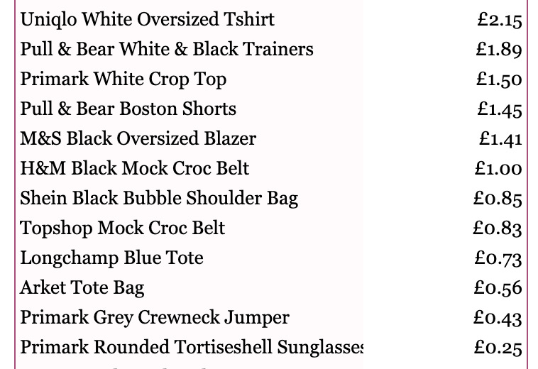
My other favourite part of the spreadsheet is the ‘Highest Cost Per Wear’ which is just an easier way of looking at the scatterplot. It helps me see what items I’m successfully getting to a sub-£1 CPW and also the items I need to wear more. A lot of the items at the bottom of this list were secondhand or were relatively cheap in the first place.
My most worn top, bottoms, and shoes so far in one outfit:

I think I’ve been subconsciously channelling Princess Diana vibes.
In a relatively short period of time, it’s really made me think about my purchasing habits. The things I tend to wear less have been impulse purchases or were purchased for a specific occasion. I’m looking forward to reviewing the data in a few month’s time to see if I can come to any more conclusions.
If you’re looking for alternatives to a spreadsheet, there is a free app called Whering that looks like it does a similar thing but you need to take photos of your clothes. Some might like this more as it creates outfits for you but I thought it seemed more of a faff.
Understandably, you too might have had the same reaction as Jim from The US Office whilst reading this so thanks for getting all the way to the end.
Lily


